Experimental Math: Fun with Number Theory
For my first lap around the track, I thought I would play around with an idea from elementary-school math, the prime factors of a number. Remember this? For some number, which shall remain nameless (but let’s call it 52), you get the prime factors by breaking the number apart into smaller numbers, that multiply together (2 X 2 X 13 = 56). If you keep breaking numbers down into littler numbers, you’ll eventually get prime numbers — so every number is the product of a bunch of prime numbers. Some numbers break down into a whole lot of prime factors (2 x 2 x 2 x 2 x 3 = 48), and some don’t (7 x 7 = 49). It seemed funny to me that some numbers blow apart into lots of tiny little bits (like 48), and some break apart only a little bit or not at all (53 doesn’t factor at all, since it’s prime). Prime numbers have been pretty well studied for centuries, but they are still largely unexplained — to this day, no one has explained why they occur where they do in the list of all numbers. They seem to pop up pretty much at random here and there. Numbers that break up into lots of little factors are “not very prime”, so to speak — they break apart very easily, whereas primes don’t break up at all.
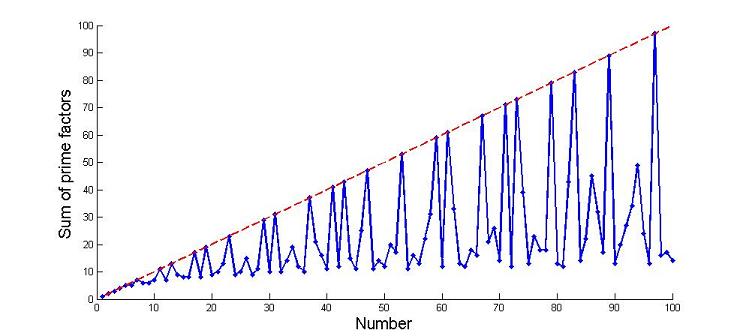
So I thought I would take a look at what happens when you take all the prime factors of a number, and add those guys up. Take the number 20, for instance. It breaks up into 2 X 2 X 5, and adding those up, you get 9. Then the next guy up — doing this to 21 gives you a value of 10 (from 3 and 7). Hmmm, are we on to something here? For 22, you get 13 (from 2 and 11). For 23, you get 23, since it’s prime. Weird! For 24, you get 9. There’s not much rhyme or reason to this, or pattern that you can put your finger on, if you try this for a bunch of numbers. Here, let’s plot what it looks like — this plot here has what the sum-of-factors looks like, for the numbers up to 100:
The blue line is the sum of factors for each number. The prime numbers appear as little spiky peaks, because for them, the sum of factors equals the number itself. The red dotted line is each number N versus itself, so prime numbers fall on the red line.
By now, you the audience reading this will have separated into two camps. One camp is saying “so what?”, and rightly so, for this really doesn’t have any practical application — I’m truly exploring here, and I haven’t the foggiest where this might lead (if anywhere). The other camp has stopped reading, and is programming this up on their linux box in Perl. I’ll pause while camp #1 packs up and heads out, and camp #2 finishes up the compiling. We’ve got everyone back? Good. Let’s go all the way out to 5000, and see what happens:
Is that cool, or is that cool? I mean, I know it’s not cool. But given the fact that it’s humongously dorky, isn’t it really cool? You can see straight lines appearing out of the random haze. That’s what I mean by “experimental mathematics” — you try something out, and some interesting feature appears out of nowhere, sometimes completely unexpectedly. In this case, the lines are pretty easy to explain — the top line contains the prime numbers, the guys who can’t be broken down at all, while the second line (which is 1/2 as high as the top line) is from guys who break down into 2 times a prime number, the third line is for guys who break into 3 times a prime number, and so on. Further down the graph, lines appear for numbers that break into 2 X 2 X [some prime], and 2 X 3 X [prime], and on and on. After a while, there are so many combinations that they blend together in a big mess.
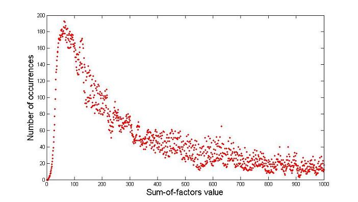
Pretty cool, eh? Oh, that’s right, we covered that it is not. But let’s try something else. I began wondering how often you may come across two different numbers that have the same sum-o-factors. Like the numbers 33, 49, and 70 — run these guys, and you get 14 for the sum of factors. How often does this happen? Who’s the most common sum-of-factor value? I thought I would look at this by doing a histogram, or a plot of how many times different values come up as the sum-of-factors for other numbers. For example, the number 7 is the sum-of-factors for only three numbers, for 7 itself, for 10, and for 12. Nobody else has their sum-of-factors equal to 7. So the number 7 comes up three times, in our histogram. If you do this for a bunch of numbers, you get a histogram that looks like this:
To make this plot, I figured out the sum-of-factors for everyone up to 100,000 and counted how many times each value came up. So there are 193 numbers between 1 and a hundred grand that have a sum-of-factors value of 63.
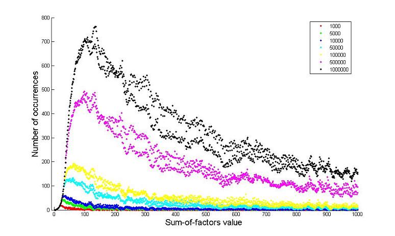
Ooops, wait a minute — what about guys above 100,000? Are there any guys above 100,000 that also have a sum-of-factors value of 63? Maybe I’m undercounting. Well, of course — the number 262144 has a sum-of-factors equal to 36, so I obviously don’t have the right histogram value for 36. I stopped at 100,000 just so I wouldn’t have to wait all day at the computer (I do have a life, after all), but if I want to do this histogram right, I need to really count all numbers up to infinity, don’t I? (All right, I do not in fact have a life.) Here’s what happens to the histogram, if you go out to just 1000, or 100,000, or a million numbers:
Pretty weird, eh? Each of those colors comes from waiting a bit longer for the computer to finish — the yellow guy is from taking points up to 100,000, the black one at the top is for a million, and the little red guy at the bottom is for just a thousand. My guess (though I’m not sure) is that the steep rising part on the left, down near zero, is the part of the graph where I’m not undercounting anymore, where I managed to catch all the numbers with that sum-of-factors value. Then where the graph stops rising, and falls over and peters off to the right, for these numbers I haven’t counted all the instances, so the histogram is too low. My bet is that if you could let your computer go out to infinity, you’d get a curve that looks like the steep rise on the left, and it would just keep steeply rising.
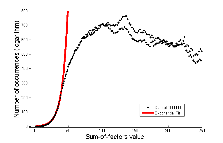
To those of you with a little experience with data (are you experienced?) are shouting about how the curve above looks like an exponential rise, connected to an exponential decay. Stop shouting, push your glasses back up, and and do the dang thing, then! Let’s take the logarithm of the plot above, and see what happens:
Well now ain’t that odd? Now the really steep rising part at the far left looks like a straight line, and so do the slowly-dropping parts at the right of the plot (more or less). The straight-line appearance on a plot of the logarithm is a dead-giveaway — they sho’ nuff look exponential. In fact, we can fit the left part of the line to an exponential, and get a pretty good fit:
It’s my suspicion that the part on the left, where I’m not undercounting (I think), will wind up being pretty close to exponential, and if I let the calculations keep going I’d get an even better fit. The fit to the 1,000,000 data shown above winds up being about exp (0.12 * x + 0.8). It’s not a perfect fit, but that’s to be expected, since I’m probably still undercounting a bit down there (e.g. number 1,000,003 might contribute more to the histogram down there), plus these kinds of fits usually look a little ragged at low n, and get asymptotically better at higher n.
Another odd thing — why does the black line split into two roughly between 250 and 600? You can kind of see a double-line thing going on in the yellow line, it’s more clear in the magenta line, and it’s yelling in your face in the black line. Why do these strange features pop up? I have no idea! And another thing — if you look at only the black line at the top, it looks a bit random — kind of like a smoke filament bending and twisting as it floats to the ceiling. There’s kind of a funny dip around 230 or so, and a bump at about 130. It looks random, but the same pattern is mirrored in the magenta line. So this is clearly a case where the data looks random, but it’s completely deterministic — those bumps are there for a reason, and if you make this plot yourself with your own computer, you’ll get exactly the same ones, in exactly the same places.
By this point, the “so what?” camp must be dying for a beer. What are you still doing here, anyway? I thought it was just us nerds, at this point. Oh, you lost your keys? Oh, you need a ride? Don’t you wish you were nicer to the nerds about four plots ago? Ah, have a logarithm, we’re all friends here. Yes, they may have peanuts. So — what’s the point? The point is, this is one more example of a very simple idea (adding up the prime factors of a number) exhibiting really complex and subtle features, with a little exploring. To my knowledge, none of this stuff has ever been published before, so it’s a new discovery. To my knowledge, it’s also a pretty useless discovery, so I won’t bother to make room on my coffee table (a giant cable spool) for a Nobel Prize. You too can do a little poking around, and my bet is you can find other cool examples like these pretty easily. Who knows, maybe you’ll find the next Mandelbrot Fractal, and your work will “inspire” countless generations of college students to come! And by “inspire”, I of course mean something to stare at while listening to Pink Floyd’s The Wall. And really, to my mind, there can be no greater honor…


 Follow Timeblimp on Twitter